10 survey form design tips for better response rates and good quality data?
When designing a form for employee engagement, such as an engagement survey, a stay interview a pulse survey or poll, and even real-time feedback, the easier the survey form is to fill out, the higher the response rate you’ll achieve.
Minimizing the amount of data entry, and minimizing the barriers to participation are two important design considerations, especially if your audience might be using mobile phones to respond to your calls to action. If users are expected to type into text fields, big fingers on small devices combined with auto-correct can lead to some interesting responses.
It is also wise to think about your follow up process to provide reminders (or nudges) to participate in your survey and acknowledgement for completing it.
Minimizing data entry
1. Choices
To minimise data entry (and to improve data quality for analytics), design your form using choices.
Drop down lists, radio buttons, checkbox lists and tags all require just one click to complete.
When a user can click versus needing to type, the data you receive will be clean and consistent providing better analytics as a result.
2. Pre-fill
Don’t provide a blank form field if you can suggest and pre-fill the most likely response.
For example, pre-fill a date with today’s date if that's the most likely response, or use 'Your current location' to pre-fill a location value.
Use sensible defaults for other form fields (some data analysis of the most common values can help).
3. Require less
Usually capturing some key information is better than capturing nothing at all.
Keeping the number of required fields to a minimum will increase response rates and still provide useful insights, versus putting contributors off by insisting they supply a raft of information before the form can be completed.
Allowing anonymous submission and optionally capturing contact details after the form is captured will also increase response rates.
Even better when pre-registration is used so that contact details only need to be supplied once.
4. Take advantage of the device and services
Modern devices allow more input types than just typing and clicking.
To capture free text or narrative, for example, voice to text using the microphone of a mobile device has now reached an acceptable level of accuracy.
Location services can provide a current location so you don't need to supply it, or location lookup services can suggest a location after just a few characters have been typed.
Services like Mailguard will validate an email address (not just the format but the actual validity) to prevent typo's from a value you might rely on for acknowledging receipt of a submission.
5. Limited navigation
Navigation consumes time, and time (and attention span) limit people's appetite to fill in survey forms. It's quicker to scroll than it is to hit "Next" to move to the next question. Keep your survey forms in a single column, on a single page with a single action button at the end to avoid the need for participants to navigate through your survey.
If it's a long survey form, or the responses may need research, allow the user to save their work and come back to it.
Removing barriers
6. Single click invitations
You will need to distribute your survey which will most likely be via an email, SMS invitation, or a button on a web page.
Regardless of the invitation type, access to the survey form should be a single click from the survey invitation; no sign-in, no landing page to click through, no further choices to make once the participant has decided to complete the survey. Any of these barriers will lower your participation levels, so a single click from request to action is going to get the best results.
7. Provide hints and guidance
Use hints, instructions and meaningful validation messages to guide your user to successfully and efficiently complete your form.
What may be crystal clear to you as a form designer may not be clear at all to the uninitiated, so always explain the intent of a survey form field and what is, and is not permissible.
8. Don't ask employees or customers to submit
When it comes to the action button for your survey form choose your words carefully.
"Submit" is a common default for action button text, but it might have negative connotations for something like an employee survey. "Send" might be a better choice, "Send Now" might create a sense of urgency, or "Send Confidentially" might quell concerns if trust is an issue.
The words you use can make a significant difference to a persons' inclination to click or not click so be deliberate in how you call your survey participants to action.
Follow up
9. Reminders
Your best response rates are going to come from an invitation process that involves reminders. These should only be sent to people who have not actioned their invitation to participate otherwise those who have already responded will be confused to receive a reminder. Our blog about the campaign feature explains more about the science of reminders.
10. Acknowledgement
Whenever someone responds to your survey they should get an acknowledgement. This should be immediate in the form of an on-screen acknowledgement and also via an email or text to advise how and when the response will be actioned. Acknowledgement, valuing the survey response (so long as it's authentic) can make all the difference in repeat participation levels the next time you run your survey.
The problem with offering choices in your survey forms
These 10 survey form design tips will stand you in good stead to increase survey response rates and quality of survey data, however, they can pose problems in day to day practicality of keeping your survey up to date.
One thing sure to impact employee and customer experience, and that is guaranteed to put off survey respondents is an out of date list of choices, that doesn't include the values they need.
Examples of choices that can quickly become outdated are things like store locations in retail, people directories in larger organisations, or product or service catalogues in customer surveys or employee suggestion campaigns.
If you are mid-campaign and values such as these change, this can cause very real challenges to the integrity and effectiveness of the campaign.
Dynamic lists to the rescue
To solve the problem of including dynamic information as choices to select from in your surveys, we have introduced the Dynamic List feature.

Unlike the other survey form field types that support choices whose values are fixed, the Dynamic List values can be easily changed without republishing your survey form.
Change once, change everywhere
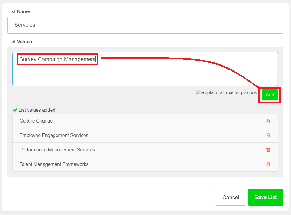
To populate or maintain values, access the list from the form menu and simply type or paste the new list of values you wish to use, either adding to or replacing existing values.

The values from the updated list will be used the next time any linked survey form is used.
You can add as many lists as you need, and link these to multiple survey forms if necessary.
You will only need to update the list in one place, to automatically apply to all of your linked survey forms.
Analytics
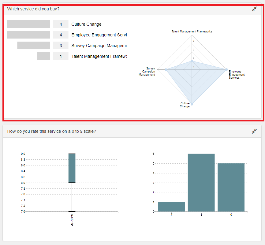
Survey responses using the Dynamic List will generate useful visualisations from which you can drill down to find insight from within your survey results.

Of course, the Dynamic List will normally be combined with other survey form fields to provide a complete dashboard of survey responses such as when used with the number filed in the example above.
We've done all the hard work for you
In the Pay Compliment platform, we have done all the hard work for you.
We have a library of pre-created survey forms covering feedback, 360 reviews, engagement surveys, coaching/check-in structures, exit and stay interviews to name a few.
You can choose to use our survey forms as-is, or edit them to create your own variations.
We also provide a simple yet powerful form builder so that you can develop your own survey forms from scratch.
Regardless of your choice to use pre-defined or self-designed survey forms, you can be certain that the 10 best practices are baked into your survey design and that simply by creating a survey form you will also be designing a powerful dashboard to interrogate survey results.
If you have any questions about survey design or need a fast and effective way to run your next survey please contact us to find out more.