
Thoughtful survey design increases the chances of completion vs abandonment
Human behaviour
What we know about human behaviour is that return on time is critical to gaining attention. Attention spans are short, so fast payoffs are the order of the day.
This presents a dilemma to organisations that wish to collect a lot of data; is it best to use short surveys more often, or a long survey once in a while?
Thinking like this drives the wrong decisions.
If you are overly concerned about the dynamics of the survey, versus the purpose of your survey, your results will be harmed.
The first question is what is the minimum amount of data required to drive the outcome of the survey, and how can you best collect that.
If the minimum data set required from each returned survey is small, no problem, you won't need to worry about overwhelm, but you will still need to be deliberate about driving high completion rates through great survey design.
However, if the amount of data you need to collect from each person surveyed is substantial, then a long survey should not be avoided or turned into a series of shorter surveys, rather it should be designed with low cognitive load and high intrinsic motivation in mind.
Expectation setting
In the survey invitation or the first page of the survey, it is best to set expectations up front. Be clear about the time required, privacy level, and the payoff to the individual.
"This workplace survey will take you less than five minutes to complete. Your answers will be combined anonymously with others and provided to management to create an action plan. Based upon your feedback, management expects to communicate the full survey results and action plan in November."
This type of survey invitation can work to overcome typical objections;
- that nothing will happen with the feedback,
- I don't have time,
- other people will do this, or
- reprisals for candour may occur
You should craft the introduction to combat the types of resistance you typically see from your survey audience, though the objections above are the minimum set to head off.
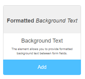
The Background Text control in our form designer is perfect for creating compelling survey introductions. It's a rich text editor so you can emphasise key points with formatting to suit your communication style.
Singular focus
Once we have the attention of the survey respondent we want to keep that attention for the entire duration of completing the survey form.
This means designing the survey to require as little mental energy as possible and avoiding cognitive overload.
Cognitive overload occurs when there are too many tasks to consider, or the difficulty of the tasks exceeds the capacity of the survey respondents working memory.
As a rough guide, working memory can hold between 5 and 9 items of information, so this is the limit of what one page of your survey should present to participants.
Questions on a page should all relate to one topic or theme, and the design of your survey questions should require the lowest possible effort to respond.
Use multiple-choice where this is possible, and small text areas (that expand if the response is verbose) versus large text area's inferring a detailed response is necessary.
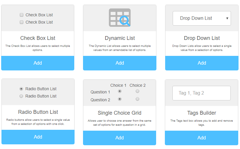
The choice controls allow low effort in survey responses which still lead to rich data when aggregating all responses.
Mandatory and Optional information
We frequently see survey forms designed with loads of mandatory information which is a deterrent to many people.
Some people are guarded about the personal information they are willing to share, and mandating that they provide a lot of personal information will certainly reduce completion rates.
Make as little as possible of your survey information mandatory so that respondents can choose the degree to which they want to engage.
Paging new
To keep attention on one topic your survey form is most likely going to need to run across multiple pages.
Breaking the survey across multiple pages can also offer the advantage of goal gradient effect. We discuss goal gradient effect in more detail in this article, but in short, it provides the survey respondent with mini boosts in motivation to complete the survey as they get further through it.
Adding a page break will allow your survey respondents to move forward to the next question set, and backwards through the information, they've already completed using the next and back buttons.
In this example, we're minimising cognitive load and providing a sense of progress using very simple questions, multi-choice responses and a short survey form page.
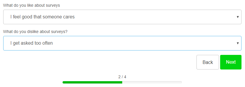
In using goal gradient effect just by reading the introduction the respondent will see some progress, by completing the first page of questions (recommended to be simple and few) they will see more. The cognitive load of page 3 and page 4 can be increased, and due to being 'almost there' the extra work involved will typically not deter the respondent from completing the entire survey.
Closure
The final page of the survey should offer instant gratification for the respondent. This may be as simple as a Thank you and a recap of what happens with the information, or it might be an entry into a prize draw or a donation to charity. The most important thing is that there should be an immediate appreciation of the time and thought given to your survey.
The picture field type in our form builder can make your closure more interesting and memorable than a traditional "Thank You" page, and importantly the more memorable and meaningful your closure this time, the more likely you will be to achieve repeat participation from the respondent next time.
Special considerations for survey completion via mobile and digital assistants
Whilst the survey design techniques above will work for any device, it's worth mentioning some new considerations.
The volume of survey responses made via mobile devices is already likely to be high, and the number of responses via digital assistants; Alexa, Siri, Cortana and "Hey Google" will be increasing.
This opens up new options for data capture such as voice and video.
The video field type in our form designer allows for submission of video responses (or picture capture).
The text and text block fields are each voice-enabled which allows responses to be spoken and transcribed rather than typed which is a great feature for lawyers, accountants, medical professionals who are used to dictation, and for field workers who may need to work hands-free.
We've done the hard work for you
The flexible form designer contains a wide variety of field types to make your survey design attractive and effective.
Better than that though, we've done the hard work for you by creating a wide range of templates for interactions such as employee engagement surveys, pulse surveys, annual performance reviews, coaching conversations, KPI tracking, Net Promoter, and so on.
We would love to work with you on creating an engaging and productive employee and customer experience with our leading employee experience platform (EXP) and consulting services.
Please contact us if we can assist you with your employee communication needs.